Want to build your own 24/7 FAQ knowledge base?
LibraryH3lp subscriptions
include unlimited independent internal or public-facing
knowledge bases.
Search the LibraryH3lp Knowledge Base
How can I generate reports for the Chat module?
94731 views | Last updated on Sep 17, 2026 admin chat reports statistics
The Analytics Reports page of the admin dashboard (US, CA, EU, SG) lets you explore and visualize your chat data. You can start with one of the built-in reports or customize a report to answer your own questions about your chat data.
Reports can be viewed as both charts and tables, and report data can be downloaded as CSV for use in Excel or another spreadsheet program.
Getting started
Choose one of the built-in reports as a starting point:
- Chats per hour — See when chats occur throughout the day.
- Chats per month — Track chat volume over time.
- Chats per protocol — See how chats are distributed among communication protocols.
- Chats per queue — Compare activity among queues.
- Chats per operator — Compare activity among operators.
- Chats per profile — Compare activity among service profiles.
- Note: By default, chat reports include answered chats of any duration.
From these starting points, you can use a built-in report as-is or customize its filters, analysis, and visualization settings.
Historical reporting data also includes data associated with queues or users that have since been deleted.
Interactive charts
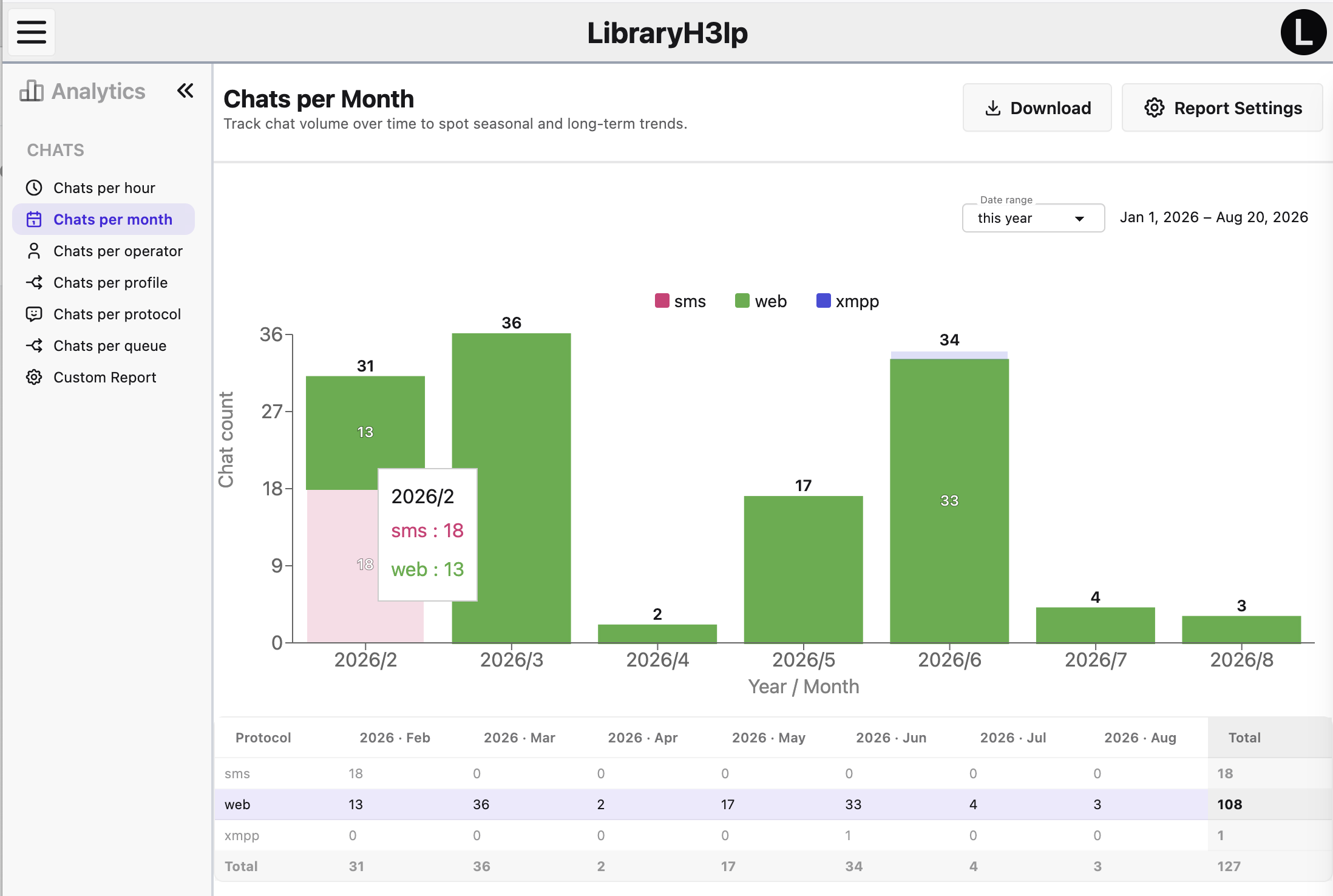
Charts have several interactive features that can help you explore the results.
- Hover over chart data to see more information about a value.
- Hover over a table row or chart data to highlight the corresponding data in the other view.
- Click an item in the chart legend to hide that series. Click it again to show it.
- The legend remains visible even when a series has been hidden, making it easy to restore.
Tables
The table view presents the same report data in a format that's useful for examining individual values.
- Totals: For reports with multiple values across a row or column, the table automatically includes totals, including a grand total where appropriate.
- Sorting: Click a column heading to sort the table. Click it again to reverse the sort order. A third click restores the original ordering.
Time-based dimensions are presented in their natural order—for example, Sunday through Saturday, January through December, and hours throughout the day. Missing time periods are included with a value of zero where appropriate.

Report Settings: Filter
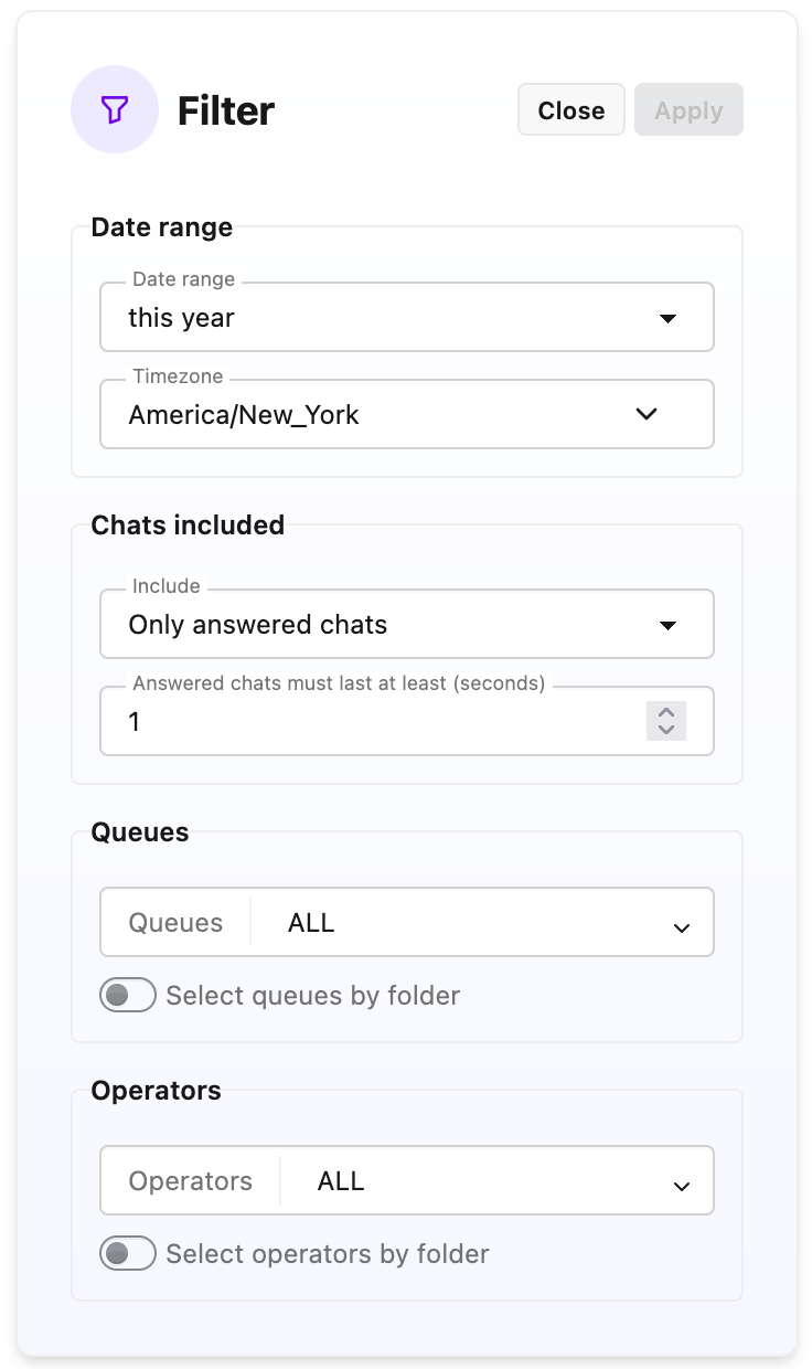
Use Filters to choose which data is included in your report. Click Edit to make changes, then Apply to update the report or Cancel to discard your changes.
You can filter by:
- Date range: Choose the period of time you want to report on. You can use one of the available date periods or specify your own dates.
- Queue: Limit the report to one or more active queues. Default is all queues, including any queues that were deleted.
- Operator: Limit the report to one or more active operators. Default is all operators, including any users that were deleted.
- Chats included: Choose whether to report on answered or unanswered chats. For answered chats, you can optionally set a minimum chat duration. By default, chats of any duration are included.
If you don't select particular queues or operators, the report includes all queues and operators that are available to you (active and deleted).
Report Settings: Analyze
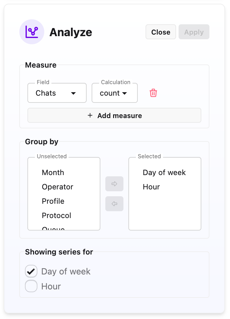
The Analysis settings control what the report calculates and how the results are organized.
- What to measure. Choose the value you want to calculate, such as counts, averages, or another available measurement.
- Group results by. Choose how the results should be divided. Depending on the report, you might group results by hour, day of the week, month, year, queue, operator, etc. You can combine multiple groupings to create more detailed reports.
- Show separate series for. When your report has multiple grouping dimensions, choose which dimension should appear as separate series in the chart. For example, you could group by month and queue and show a separate series for each queue.
Click Apply when you're ready to update the report.
Report Settings: Visualize
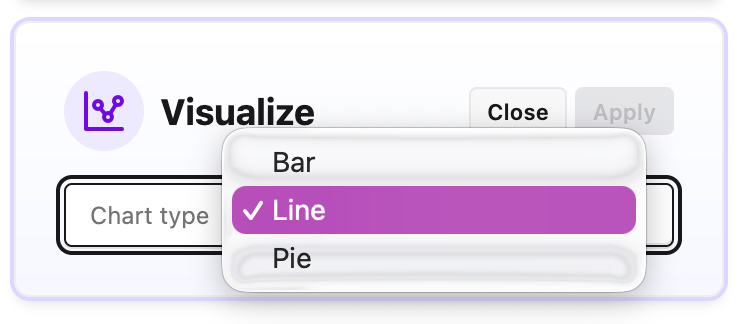
Use Visualization to choose how your results are displayed. Depending on the data in your report, you can display it as a:
- Bar chart
- Line chart
- Pie chart
You can also switch between the chart and table views of your report.
Downloading reports
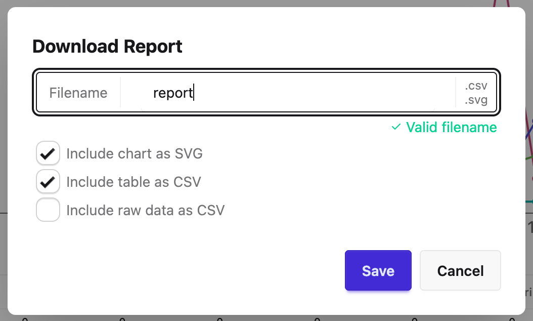
You have several options for downloading reports:
- Include an image of the chart as seen on screen in PNG format.
- Include the table as seen on screen in CSV (comma-separated value) format or use in Excel or another spreadsheet program.
- Include the raw data which was used to generate the table seen on the screen in CSV format. This can be useful if you want to perform your own analysis or create a different pivot table in a spreadsheet.
FAQ URL:
More Help
Search By Topic
Stay Connected
